
Introduction
Looking to add a visually impressive, 3D-style image slider to your website? You’re in the right place! In this blog, we’ll walk through a 3D Image Slider project created using HTML, CSS, and JavaScript. This slider creates an immersive experience by rotating images in 3D space, grabbing the user’s attention with sleek transitions and modern design.
You can find the source code on GitHub here:
👉 3D Image Slider – GitHub Repo
🌟 Features of This Project
- Pure HTML, CSS, and JavaScript – no external libraries!
- 3D image rotation using CSS
transformandperspective - Clean and responsive design
- Smooth navigation with left/right controls
- Easily customizable for any portfolio or image gallery
Tech Stack Used
| Technology | Purpose |
|---|---|
| HTML | Markup structure |
| CSS | Styling and 3D animation |
How It Works
- The image slider wraps all the images in a
carouselcontainer. - Each image is placed on the circumference of an invisible circle using
transform: rotateY()andtranslateZ(). - JavaScript handles navigation buttons to rotate the entire carousel, simulating a 3D rotation effect.
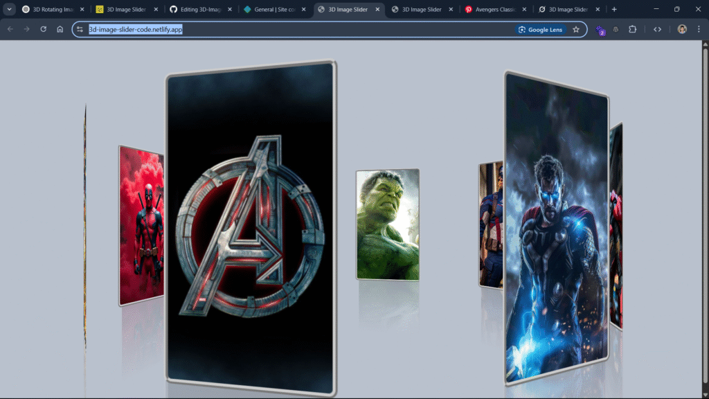
Screenshot / Demo
Folder Structure
3D-Image-Slider/
├── index.html
├── style.css
└── script.js
HTML Code (index.html)
<!DOCTYPE html>
<html lang="en">
<head>
    <meta charset="UTF-8">
    <meta name="viewport" content="width=device-width, initial-scale=1.0">
    <title>3D Image Slider</title>
    <link rel="stylesheet" href="style.css">
</head>
<body>
    <div class="container">
        <span style="--i:1"><img src="https://i.pinimg.com/736x/5c/15/d8/5c15d83d0bac7cedaed77e79f2fd7d52.jpg" alt=""></span>
        <span style="--i:2"><img src="https://i.pinimg.com/736x/3f/28/7a/3f287a000945262cd30887d0566d12c6.jpg" alt=""></span>
        <span style="--i:3"><img src="https://i.pinimg.com/736x/c2/a0/33/c2a0337b4f31d857df60bcada1f5dd50.jpg" alt=""></span>
        <span style="--i:4"><img src="https://i.pinimg.com/736x/78/75/87/7875870c356eba6fdf8cb48aa749c17f.jpg" alt=""></span>
        <span style="--i:5"><img src="https://i.pinimg.com/736x/bd/61/0c/bd610cd62681bdf01639ebb6e396163e.jpg" alt=""></span>
        <span style="--i:6"><img src="https://i.pinimg.com/736x/d1/37/e4/d137e41ee75cd35ea3fd52aabfc8a635.jpg" alt=""></span>
        <span style="--i:7"><img src="https://i.pinimg.com/736x/79/ce/e4/79cee48c5367a0f2eef52c849d95d374.jpg" alt=""></span>
        <span style="--i:8"><img src="https://i.pinimg.com/736x/cb/d7/2e/cbd72efbfd9eb6baeeffc71e884489a1.jpg" alt=""></span>
    </div>
</body>
</html>
CSS Code (style.css)
body{
    background-color: #b9c1cd;
    display: flex;
    justify-content: center;
    align-items: center;
    min-height: 100vh;

}
img{
    height: 350px;
    width: 200px;
}
.container{
    width: 200px;
    height: 350px;
    position: relative;
    transform-style: preserve-3d;
    transform: perspective(1000px);
    animation: gallery 20s linear infinite;
    cursor: pointer;
}
.container span{
    position: absolute;
    width: 100%;
    height: 100%;
    transform-style: preserve-3d;
    transform: rotateY(calc(var(--i)*45deg)) translateZ(500px);
    -webkit-box-reflect: below 2.5px linear-gradient(transparent, transparent, rgba(3,3,3,0.2));

}
.container span img{
    position: absolute;
    border-radius: 10px;
    border: 6px ridge #ccc;
}
@keyframes gallery{
    0%{
        transform: perspective(1000px) rotateY(0deg);
    }
    100%{
        transform: perspective(1000px) rotateY(360deg);
    }
}
Use Cases
- Portfolio websites
- Photography galleries
- Product showcases
- Landing pages needing visual interaction
Conclusion
This 3D Image Slider is a great example of how simple technologies can create stunning user experiences. Whether you’re a beginner learning web animations or a frontend dev looking to spice up your UI, this project is worth a try!